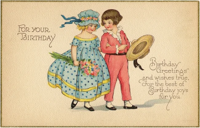
They don't make birthday cards like this any more. This example of charming Victoriana, printed on textured paper, harkens to days long since past. Having said that, did you notice the colour of the clothes the two are wearing? For many generations blue was associated with girls and pink with boys. But something strange happened in the 1940s – the two colours swapped roles.
Up until that time, young boys were often dressed in pink, for it was seen as a variation of red – an aggressive, power-wielding, militaristic colour. And girls were adorned in blue – considered an ethereal, passive and non-confrontational colour. As a 1918 article in the magazine Earnshaw’s Infant’s Department states, “the generally accepted rule is pink for the boys, and blue for the girls. The reason is that pink, being a more decided and stronger color, is more suitable for the boy, while blue, which is more delicate and dainty, is prettier for the girl.” I was taken aback. That's not what I grew up knowing. Why the switch?
It appears the change began post-WWII. The purchasing power of the baby boomer era was quite unlike anything ever seen before and, as a result, advertising became increasingly strategic and targeted. In addition, the growing popularity of television was having a considerable impact on the way retailers reached their audiences. Marketers, capitalizing on the fact that visual appearance greatly influences shopper's decisions, aligned each gender with a specific colour. Using pink and blue to promote products to girls and boys made it easier to sell everything from clothing to toys. The colours become a mnemonic for the consumer – helpful for parents, astonishly effective on children. Advertise a new pink tricycle and, chances are, a young girl is immediately interested. Here's where the story gets strange – there was no apparent reason for the reversal of roles. Considering the retail climate of the time, Jo B. Paoletti, a historian at the University of Maryland and author of Pink and Blue: Telling the Girls From the Boys in America, says, “It could have gone the other way.” In other words – there was no logical rationale for the colour shift.

With that in mind, I thought it would be interesting to examine how three artists have addressed the arbitrary coupling of pink and blue with gender. The mercurial history of this partnership shows just how frivolous colour meanings and associations can be.
British conceptual artist Daniel Eatock has an understated yet effective piece entitled Mail-Femail. As a former graphic designer, his knowledge of standards for print material, including stationery, provide the ideal fodder for poking fun at existing colour specifications. The colour blue, used as a solid or in a pattern, has long been associated with envelope interiors – primarily to disguise a letter’s contents from being viewed. Some airmail envelopes utilize the colour to distinguish them from the regular post. Blue, being suggestive of the sky, reminds us that an air mail letter has travelled via aircraft from some far-off locale. When you see Eatock's blue and pink window envelopes together it’s hard not to smile. Aided by a clever wordplay, the piece makes us ponder colour’s contribution to our understanding of a particular object – whether those colour choices were intentional or not.

Artist: Daniel Eatock
Title: Mail-Femail
Medium: Paper
Year: 1998
Size: Unknown
Korean artist JeongMee Yoon remembers watching as her daughter’s obsession with all things pink grew to the point of becoming the only colour the five-year old would wear. Yoon thought this might be a Korea-based phenomenon, but quickly learned that cultures throughout the world were experiencing this same pink fascination. She photographed her daughter surrounded by her many pink possessions to document the impact the colour was having on her life. Yoon discovered that for many boys the same was true for the colour blue. Since 2005, as part of The Pink + Blue Project, she has been photographing boys and girls with their monotone belongings in an effort to draw attention to this worldwide trend. Yoon says, “these kinds of divided guidelines for the two genders deeply affect children’s gender group identification and social learning.” Unlike Eatcock's Mail-Femail, there is nothing subtle going on here. The garishness of the images emphasize the overwhelming influence these colours are having on many susceptible children.

Artist: JeongMee Yoon
Title: The Pink & Blue Project
Medium: Photography
Year: 2005 - ongoing
Size: Unknown
In playgrounds throughout North America there are children’s rides known as rocker riders. Some have plastic rocker bases similar to those found on a rocking horse, others sit atop sturdy metal springs. Typically these solid-coloured, smooth-surfaced rides are fashioned as stylized animals – ponies, elephants, ducks, etc. The rockers are designed to be unisex, as to appeal to children between the ages of three and eight. American artist Jeff Koons, who has a fascination with popular culture, provokes discussion around gender with his sculpture Split Rocker (Pink/Blue). Koons assembles a single rocker rider head from two halves of different animals – one side is pink, the other is blue. The awkwardness of this plastic Frankenstein is emphasized by the failure of the two components to form a seamless connection. The artist injects gender into an otherwise innocent plaything, leaving one to wonder who this particular ride is designed for? A yellow elephant is fun, but a pink and blue, googly-eyed dino-pony is downright perplexing.

Artist: Jeff Koons
Title: Split Rocker (Pink/Blue)
Medium: Polychromed aluminum
Year: 1999
Size: 13.5” x 14.5” x 13.0"
Colours and the things they associate themselves with are often straightforward. Take the colour green for example. Due to its prevalance in nature, green suggests growth, new beginnings and harmony. Conversely, some colour meanings are less obvious and become arbitrarily established, their emotional connections achieved through consistent positioning and promotion. Pink for girls and blue for boys, fall into the later category. These pairings are made all the more fickle when you learn that they once represented the exact opposite values. Mail-Femail, The Pink & Blue Project and Split Rocker (Pink/Blue) cause us to rexamine what these two colours have come to symbolize and remind us that, when it comes to colour, we are all capable of being manipulated.