In the fall of 2015 I spent thirty days traveling across the USA, from Seattle to Buffalo, on a photography road trip. I prefer taking black and white photographs, but on this particular occasion I forced myself to try and shoot an equal number in colour. I found it interesting that, after reviewing the thousands of photographs taken during the trek, it was the colour images that excited me most.
When I thought about how best to explain why I am writing a blog about colour, a number of photographs from that trip came to mind. With the help of three particular images, I’ll explain the reasons for this new endeavour of mine.

1. DISCOVERY Sometimes I’ll come across an array of colours that are totally unexpected and inspirational. For me, the palette featured in this photograph of an abandoned bar in North Platte, Nebraska is remarkably refined. The soft tones of the ecru bricks, the grey sidewalk and the butter yellow curb inadvertently frame the confident blue-black and maroon of the White Horse bar. Notice too, when you look closely at the sheets draping the windows and the weathered lettering, that four to five different shades of white emerge. These colours all work together so well. Finding unusual colour combinations like these just make me want to discover more.

2. INSIGHTS I’m intrigued as to why things are coloured a certain way. In this photograph there are many examples to consider. The coral pink gravel seems strange, but I assume it’s native to the area. Conversely, the pink filling hut has me puzzled – was someone trying to match it to the gravel? The bright red and yellow farm implement behind the hut speaks to its need to be highly visible for safety reasons. The fire hydrant, with its year-round Christmas colours, most likely signals a specific water pressure level to firefighters. Other colours seem more random, as in the moss green hose, the robin's egg blue tin can and the safety orange electrical box. The bigger structures located in the background – the oil tank, silos and elevators – are metal or painted metal surfaces. Are their colours intended to reflect light, absorb light or, perhaps, express the brand of a particular company? Colours are often used for practical reasons and I enjoy learning about them.
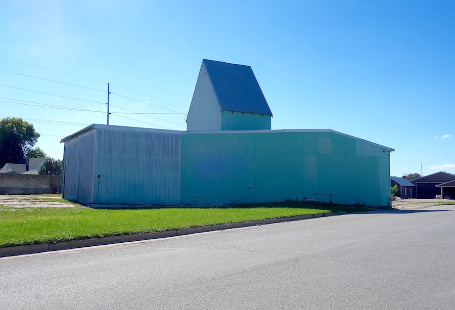
3. ALLURE We tend to take colour for granted, forgetting just how captivating it really can be. I couldn’t believe my eyes when I came upon this building in a small Wisconsin town. The melange of blues – turquoise, sea, meridian – creates an undulating pool of colour that swims across the rippling metal siding. Ambient light and time also contribute to the overall effect. The clear blue sky and lush green grass establish that this is an actual place, but the structure's colour, combined with its unconventional shape, make it seem otherworldly. Whether produced by people or nature, colour can be full of surprises.
COLOUR STUDIES is intended to be a journey of its own. There is no predetermined destination, no route and no agenda – just an open-ended exploration. So ride along with me as I discovery unusual, compelling and exciting stories about the colours that make up this world.
If you’re interested, you can see more photographs from my road trip here.